Phil D Gardner
View profile
Naturo
Naturo Pet Food, an Irish-based premium pet food brand
Scope:
Website rebuild and replatform
/
Client:
Naturo
/
Duration:
3 Months
/
Year:
2024
View live site


Define
[01]
Who, what and why
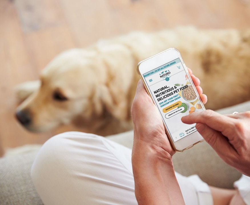
Naturo needed to shift from an outdated, content heavy website to a modern ecommerce experience that matched the quality of their products. The old site was difficult to manage and the navigation made it hard for customers to find what they needed.
The project called for a simpler, more human experience that supported Naturo’s growth and helped customers choose products with confidence.
Analyse
[02]
The challenge
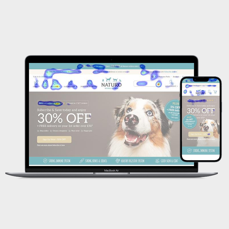
Understanding how people used the site came first. Analytics highlighted sticking points and repeated drop offs. Mapping the old structure showed that the navigation followed internal language rather than how customers naturally shop for pet food.
The user patterns were quite evident. People wanted quick routes into categories like age, diet and pet type. They expected clear nutritional information and easy comparison. This insight guided the new structure and shaped the direction of the redesign.
From the Naturo point of view they wanted to drive more users towards their subscription service, better showcase their quality of product and ingredients, and finally, improve the mobile experience.


scrollable


Design / Prototype
[03]
Design approach
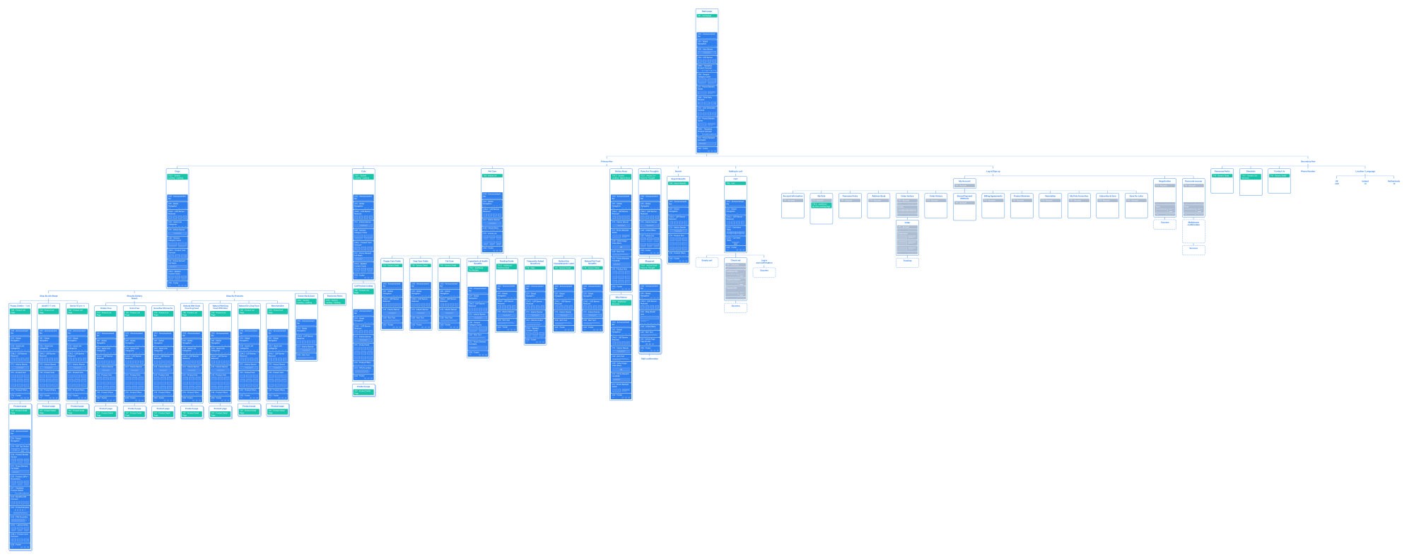
The new sitemap was centred around real customer behaviour, not business terminology. Product pathways were simplified and category logic became more intuitive.
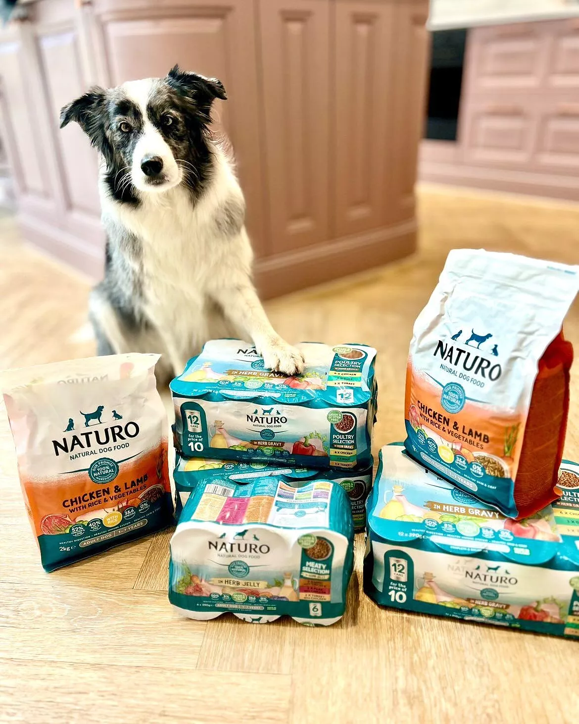
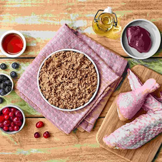
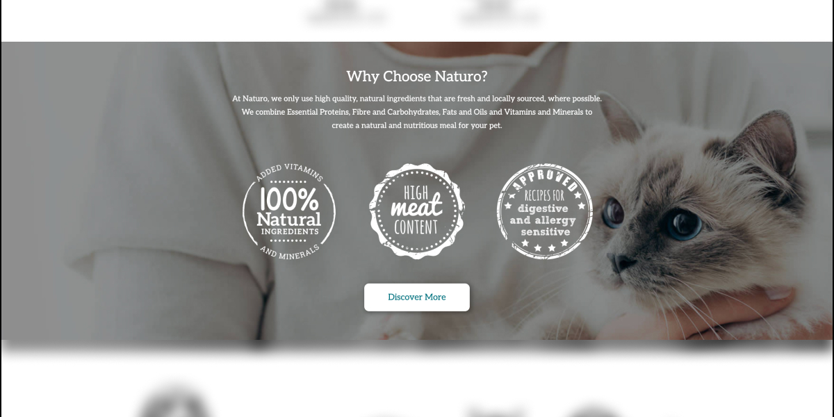
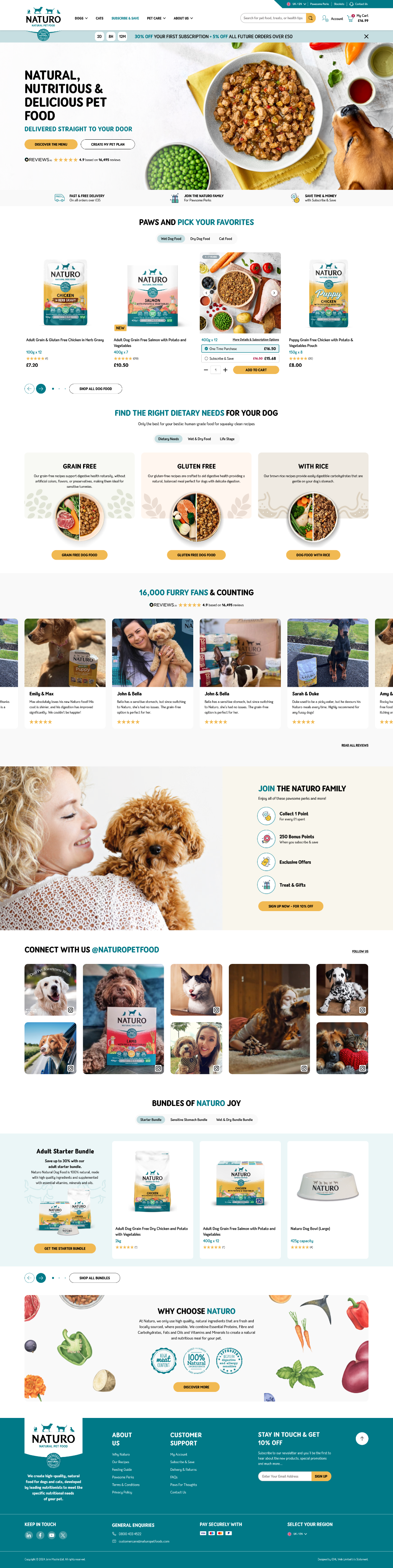
The visual language was refreshed to feel cleaner and more natural, with cleaner colours and clearer typography that supported readability. This included us guiding them towards a more product forward image style, showing the ingredients in a bird's-eye view, visually hiding nothing from the users.
Interactive prototypes helped the Naturo explore the new structure, style and tone in a realistic way. This made the content hierarchy and interaction patterns far clearer and built alignment across stakeholders. Product cards, filters and navigation were shaped through this stage.
Original
New
Static
/
Grey
/
Limited visual clues to the brand
/
No visual clues to the product.
Launch
[04]
Results
The site launched in March 2025. While performance data was being gathered at the point I left, the client provided overwhelmingly positive feedback on the process and results, citing:
- A more intuitive and attractive user experience
- Strong alignment between brand identity and digital presence
- Clearer emphasis on subscription offerings
- A collaborative, transparent design process
Scrolls on tap
Summery
[05]
Key Takeaways
I believe you can learn from every project, even if they journey isn’t always as smooth as first hoped.
View live site
Discovery is critical
1
Deep workshops and stakeholder alignment helped us uncover pain points and opportunities that weren’t immediately obvious.
Ask the extra question
2
Being proactive in reframing the scope helped the client think bigger — and led to a stronger end result.
Build on brand trust
3
Small visual shifts can make a big difference in evolving a brand without losing its identity.
Phil D Gardner
Whether you’re looking for your next problem solver or looking for a conversation , I’d love to have a chat.
philipdavidgardner@hotmail.comExplore my profile and view my CV.
View profile page
Phil D Gardner
View profile
Naturo
Naturo Pet Food, an Irish-based premium pet food brand
Scope:
Website rebuild and replatform
/
Client:
Naturo
/
Duration:
3 Months
/
Year:
2024
View live site


Define
[01]
Who, what and why
Naturo needed to shift from an outdated, content heavy website to a modern ecommerce experience that matched the quality of their products. The old site was difficult to manage and the navigation made it hard for customers to find what they needed.
The project called for a simpler, more human experience that supported Naturo’s growth and helped customers choose products with confidence.
Analyse
[02]
The challenge
Understanding how people used the site came first. Analytics highlighted sticking points and repeated drop offs. Mapping the old structure showed that the navigation followed internal language rather than how customers naturally shop for pet food.
The user patterns were quite evident. People wanted quick routes into categories like age, diet and pet type. They expected clear nutritional information and easy comparison. This insight guided the new structure and shaped the direction of the redesign.
From the Naturo point of view they wanted to drive more users towards their subscription service, better showcase their quality of product and ingredients, and finally, improve the mobile experience.

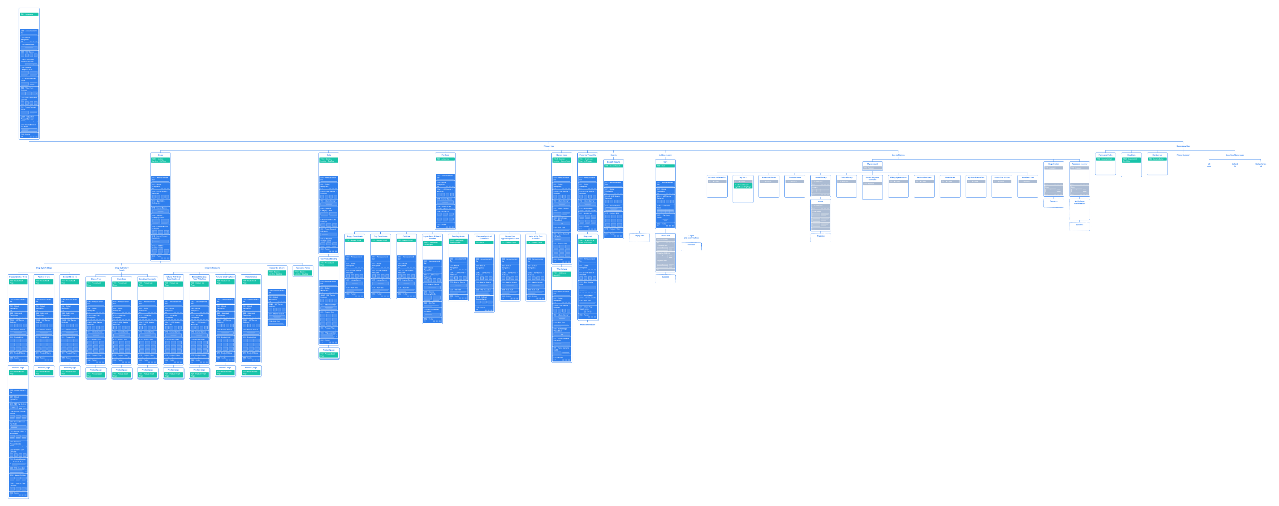


scrollable


Design / Prototype
[03]
Design approach
The new sitemap was centred around real customer behaviour, not business terminology. Product pathways were simplified and category logic became more intuitive.
The visual language was refreshed to feel cleaner and more natural, with cleaner colours and clearer typography that supported readability. This included us guiding them towards a more product forward image style, showing the ingredients in a bird's-eye view, visually hiding nothing from the users.
Interactive prototypes helped the Naturo explore the new structure, style and tone in a realistic way. This made the content hierarchy and interaction patterns far clearer and built alignment across stakeholders. Product cards, filters and navigation were shaped through this stage.
Static
/
Grey
/
Limited visual clues to the brand
/
No visual clues to the product.
Original
New
Launch
[04]
Results
The site launched in March 2025. While performance data was being gathered at the point I left, the client provided overwhelmingly positive feedback on the process and results, citing:
- A more intuitive and attractive user experience
- Strong alignment between brand identity and digital presence
- Clearer emphasis on subscription offerings
- A collaborative, transparent design process
Scrolls on click
Summery
[05]
Key Takeaways
I believe you can learn from every project, even if they journey isn’t always as smooth as first hoped.
View live site
Discovery is critical
1
Deep workshops and stakeholder alignment helped us uncover pain points and opportunities that weren’t immediately obvious.
Ask the extra question
2
Being proactive in reframing the scope helped the client think bigger — and led to a stronger end result.
Build on brand trust
3
Small visual shifts can make a big difference in evolving a brand without losing its identity.
Phil D Gardner
Whether you’re looking for your next problem solver or looking for a conversation , I’d love to have a chat.
philipdavidgardner@hotmail.comExplore my profile and view my CV.
View profile page
Phil D Gardner
View profile
Naturo
Naturo Pet Food, an Irish-based premium pet food brand
Scope:
Website rebuild and replatform
/
Client:
Naturo
/
Duration:
3 Months
/
Year:
2024
View live site
Define
[01]
Who, what and why
Naturo needed to shift from an outdated, content heavy website to a modern ecommerce experience that matched the quality of their products. The old site was difficult to manage and the navigation made it hard for customers to find what they needed.
The project called for a simpler, more human experience that supported Naturo’s growth and helped customers choose products with confidence.
Analyse
[02]
The challenge
Understanding how people used the site came first. Analytics highlighted sticking points and repeated drop offs. Mapping the old structure showed that the navigation followed internal language rather than how customers naturally shop for pet food.
The user patterns were quite evident. People wanted quick routes into categories like age, diet and pet type. They expected clear nutritional information and easy comparison. This insight guided the new structure and shaped the direction of the redesign.
From the Naturo point of view they wanted to drive more users towards their subscription service, better showcase their quality of product and ingredients, and finally, improve the mobile experience.
scrollable
Design / Prototype
[03]
Design approach
The new sitemap was centred around real customer behaviour, not business terminology. Product pathways were simplified and category logic became more intuitive.
The visual language was refreshed to feel cleaner and more natural, with cleaner colours and clearer typography that supported readability. This included us guiding them towards a more product forward image style, showing the ingredients in a bird's-eye view, visually hiding nothing from the users.
Interactive prototypes helped the Naturo explore the new structure, style and tone in a realistic way. This made the content hierarchy and interaction patterns far clearer and built alignment across stakeholders. Product cards, filters and navigation were shaped through this stage.
Static
/
Grey
/
Limited visual clues to the brand
/
No visual clues to the product.
Original
New
Launch
[04]
Results
The site launched in March 2025. While performance data was being gathered at the point I left, the client provided overwhelmingly positive feedback on the process and results, citing:
- A more intuitive and attractive user experience
- Strong alignment between brand identity and digital presence
- Clearer emphasis on subscription offerings
- A collaborative, transparent design process
Scrolls on click
Summery
[05]
Key Takeaways
I believe you can learn from every project, even if they journey isn’t always as smooth as first hoped.
View live site
Discovery is critical
1
Deep workshops and stakeholder alignment helped us uncover pain points and opportunities that weren’t immediately obvious.
Ask the extra question
2
Being proactive in reframing the scope helped the client think bigger — and led to a stronger end result.
Build on brand trust
3
Small visual shifts can make a big difference in evolving a brand without losing its identity.
Phil D Gardner
Whether you’re looking for your next problem solver or looking for a conversation , I’d love to have a chat.
philipdavidgardner@hotmail.comExplore my profile and view my CV.
View profile page